Iconotes.
Longer reads on the craft
- 01
Why twenty-four pixels
How the default icon grid got its size, and when to ignore it.
- 02
The floppy disk problem
Metaphors that outlive the objects they were drawn from.
- 03
Drawing for sixteen
What survives when every line has half the room it wants.
- 04
Stroke weight and type
Matching an icon to the text it will always sit beside.
- 05
Naming a set
The unglamorous work that decides whether anyone can use your icons.
- 06
When to break the grid
The cases where the rules produce a worse drawing.
By Jahanvi.
Designing icons for healthicons.org.
Featured twice on Streamline blogs.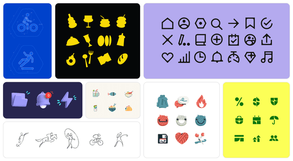 August
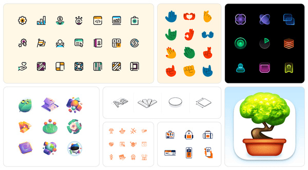 November